

The Remote Control Is the Hard Part
Saurabh Singh6 min read
Every screen your product runs on shares one assumption, and television breaks it.
On a laptop you point at a thing and click it. On a phone you touch the thing directly. Both are direct input: any element on screen is one gesture away, regardless of what surrounds it. Design for those and you are arranging things in space, trusting the user to reach whatever they want.
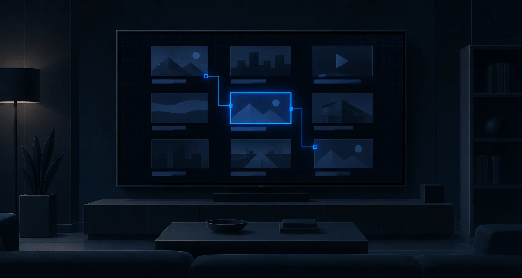
A television has no pointer. It has a directional pad — up, down, left, right, OK, back — and a person sitting ten feet away. Nothing is one gesture away. To reach an element you travel to it, one step at a time, through whatever happens to lie between you and it.
That single difference is why a TV app cannot be a resized web app, and why the first thing worth building is not a mockup.
Reach versus traversal
Consider a grid of twelve tiles. On the web, the twelfth tile costs exactly as much as the first: one click. On television, it costs however many presses it takes to get there — and the count depends entirely on what path you built between them.
This inverts how layout decisions get made. On the web, position is mostly an aesthetic and hierarchy question. On television, position is interaction cost. Putting your primary action in the bottom-right of a dense grid is not a visual preference; it is a decision that this action takes seven button presses.
Which means the real artefact underneath a TV interface is not a layout. It is a graph: every focusable element as a node, every legal D-pad move as an edge.
The focus model
We map that graph before any visual design, and it is the single practice that separates TV apps that feel right from TV apps that feel broken.
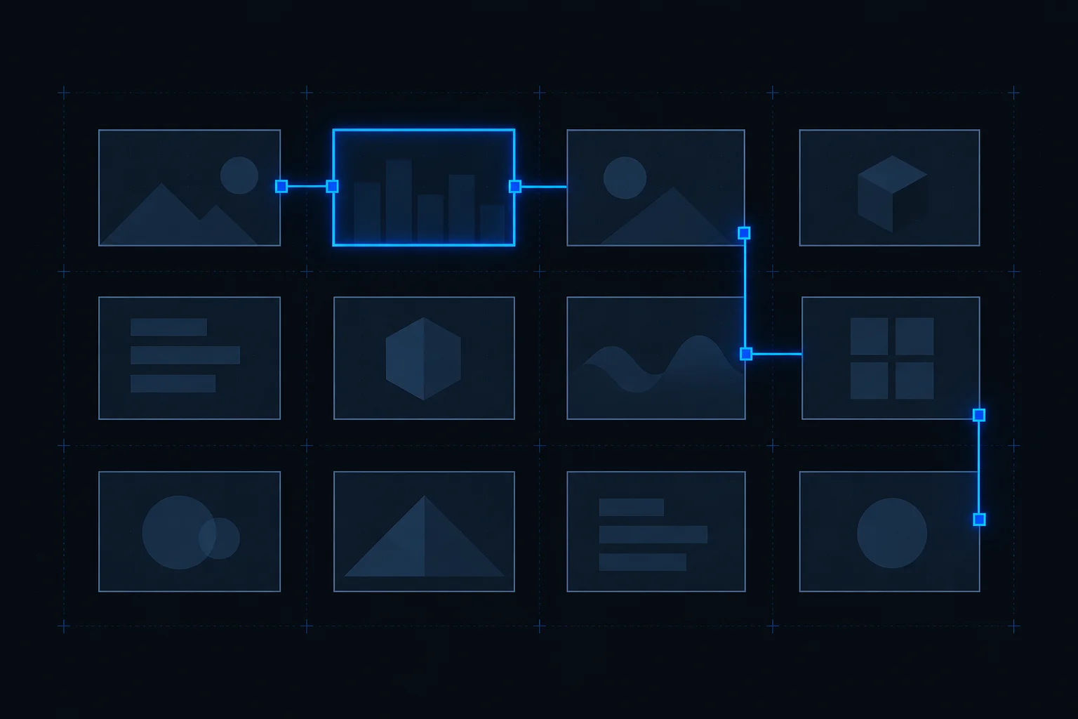
Get it wrong and the failures are specific, reproducible, and immediately obvious to anyone holding a remote:
- Dead ends. An element you can enter but not leave, usually because someone defined a "down" edge without the matching "up" one. The user's only escape is the back button, if it is wired at all.
- Focus traps. A modal or carousel that swallows every direction key. Common when a component manages its own focus without telling the rest of the screen it has taken over.
- Unreachable elements. Something renders on screen with no edge pointing at it. It is visible, it looks interactive, and no sequence of presses will ever land on it.
- Inconsistent ordering. Pressing "down" then "up" does not return you where you started. Individually forgivable; across a whole app it makes the interface feel untrustworthy, and users stop exploring.
None of these are visual bugs, which is exactly why design review does not catch them. A static mockup of a broken focus model looks identical to a working one. They surface only when someone picks up a remote — and if that first happens during certification, you are rebuilding navigation under a deadline.
There is a second-order effect worth naming. Because traversal is sequential, the order of your content is a much stronger signal on TV than on any other surface. On a web page, a user scans and jumps. On a television, they walk past everything in between. What you put early in the path gets seen far more than what you put late, and no amount of visual emphasis compensates for being eight presses away.
The ten-foot part is the easy part
Most writing about TV interfaces concentrates on the ten-foot viewing distance: larger type, higher contrast, generous hit targets, more spacing than feels right on a monitor.
That advice is correct, and it is also the least difficult thing on this list. Every platform documents its own numbers, the rules are largely mechanical, and mistakes are caught the first time anyone views the screen from a sofa rather than a desk.
It gets disproportionate attention because it is the part that photographs well and the part a designer can act on alone. The focus model is harder precisely because it is invisible in every static artefact your process produces.
Playback that degrades instead of stalling
If your TV app exists to play video — and most do — then the quality bar is not how good the stream looks at its best. It is what happens when the connection drops.
Adaptive bitrate streaming over a CDN is the mechanism: encode at several quality levels, and let the player step down when bandwidth tightens instead of stopping to buffer. A viewer will forgive a picture that softens for a few seconds. A spinner in the middle of a video is the moment they leave.
Where content licensing requires it, DRM sits on top of that, and it brings its own platform-specific constraints — another reason the delivery layer is worth settling early rather than treating as a detail of the player component.
The hardware is slower than your desk
TV apps run on devices people bought years ago and have no intention of replacing. A streaming stick bought in 2019 is still plugged in, still receiving updates, still in your analytics.
These devices have real memory ceilings and modest processors. An image grid that scrolls smoothly on a development machine can stutter badly on the actual hardware, and the gap between the two is much wider than the equivalent gap on mobile. This is why device testing on the low end is not optional and cannot be deferred: the performance ceiling is a design input, not a late optimisation.
Certification is stricter than app review
Getting onto a TV platform is more prescriptive than shipping to a mobile store. Requirements cover navigation behaviour, playback controls, back-button semantics, memory use and how the app handles being suspended and resumed.
The practical consequence is that certification requirements should shape the build from the start rather than being addressed at the end. Most of what certification checks is behaviour, and behaviour is expensive to retrofit — particularly navigation behaviour, which is the thing you would least like to rewrite last.
What this looked like in practice
We built RealVision's platform across web, mobile, iPad and TV. The TV applications were built natively for remote-control navigation rather than adapted from the touch interfaces, and that was a deliberate cost: it is more work than porting, and it is the difference between an app that behaves like a television app and one that behaves like a website someone is operating with a remote.
The rest of the stack followed the same reasoning — adaptive bitrate streaming over a CDN so playback degraded rather than stalled, and encoding handled upstream so every platform drew from one pipeline rather than four.
Where to start
If you are planning a television app, the first artefact is not a mockup. It is a navigation graph: every focusable element, every legal move between them, and a walk through the paths to your three most important actions with the presses counted.
That document will tell you more about whether the product will feel right than any number of screens will — and it costs a fraction of what it costs to discover the same thing during certification.
We build TV and streaming applications for Roku, Fire TV and smart TV platforms. If you are weighing one up, tell us what you are trying to ship.
Have a project this applies to?
Tell us what you're building and what it has to handle. We'll come back with an architecture opinion and a realistic first milestone.
- Reply within one business day
- NDA on request
- No obligation